VANITY
DESIGN FOR COLOR-BLINDNESS
In this project, we designed a mobile app that helps color-blind people to pick out outfits. There are lots of color-identifying apps out there in the market. The main purpose of the app is not to identify colors for blind people but to suggest outfit based on their personal taste.
By uploading the photo of their everyday wear, the app, Vanity uses machine learning algorithms to learn users’ personal styles, preferred color combinations, and recommend outfits and accessories that go well together. Users can save their favorite combination in the app to reduce the burden of choosing outfits in hectic moments.
Type:
Course project
Oct-Dec 2019 (10 weeks)
Teammates:
Monikka Ravinchandran
Yirang Choe
My Roles:
UX research
Product design
DESIGN GOAL
Create a design solution that helps color-blind people solving their challenges in their life and work.
According to the research, color blindness affects approximately 8% of males and 0.5 females worldwide. In the Inclusive Design class, we were asked to work with a user group that we believed was underserved and designed a technological solution to one of their problems. Our team chose to work with color-blind people. There are many examples in our daily life that only use color as signifiers, for example, traffic lights, metro maps, etc. As color plays an important role in our everyday lives, we were interested in learning the challenges of people with color blindness and understanding their needs.
USER RESEARCH
Conduct user Interview to understand their challenges
We did the background research to first understand color blindness and to get a high-level overview of what kind of problems they might have in their life. We then recruited one color-blind user as our interviewee to learn and dive deeper into the challenges she faced in work and life, to understand her perspectives towards color blindness, and to discover her needs and wishes regarding being color-blind.
About the interviewee: She is an interior designer, has green color blindness. She's interested in fashion and home decoration.

Her challenges came from personal life instead of her work
In the interview, she talked about the challenges and problems she had and how she usually dealt with it. Interestingly, her main problems related to color coming from her personal life instead of her work as our expectation. She told us she could prepare earlier for her work, like checking the color before client's meeting; however, the challenges she had in life were more spontaneous. Therefore, we decided to focus on the problem she had in life. Below are the major findings and the problem spaces that we later based our design solution on.
1. She carried her cell phone with her all the time in case she needed it to identify the color. As an interior designer and fashion lover, she liked to play with different colors. However, if she ran into the difficulty of identifying colors, she usually relied on the app installed on her mobile or use the app on her laptop to tell the colors at work.

2. Matching clothes and accessories was one of the challenges she had. She liked to match her accessories (necklace, rings, earrings, etc) with minimal color on her top, which was sometimes difficult for her to tell. For example, if the minimal color on her top is blue, she would like to match the accessories in blue. This was her personal style.

3. Due to her green color blindness, she tended not to buy clothes in green. Green clothes were not the safest choice for her as she was green color blindness. With her strong personality and favor in color combination, she tended to skip the greenish options when she went shopping.
4. She didn’t regard her color blindness as a disability since she still could tell most of the color, just some shades of green were confusing. Therefore, she mentioned that the awareness of color-blindness should be perceived more correctly. There are different types of color blindness. Not all color-blind people are monochromacy.

5. Memorizing "position" was a way for her to identify colors. She usually used the position of the object to identify colors that she was uncertain.

PROBLEM IDENTIFIED
How might we help people with color blindness pick out clothes and accessories from their wardrobe that match based on their personal style and color preferences?
Based on the user interview, we identified one problem as above to help us focus on the project goal and converge our brainstorming ideas. The problem statement was constructed due to the fact that the participant had a hard time matching tops, bottoms, and accessories in her daily life. Being a mom and working full-time, she didn't have time to play with different combinations every morning even though she wanted to, especially when it comes to the color-matching with accessories.
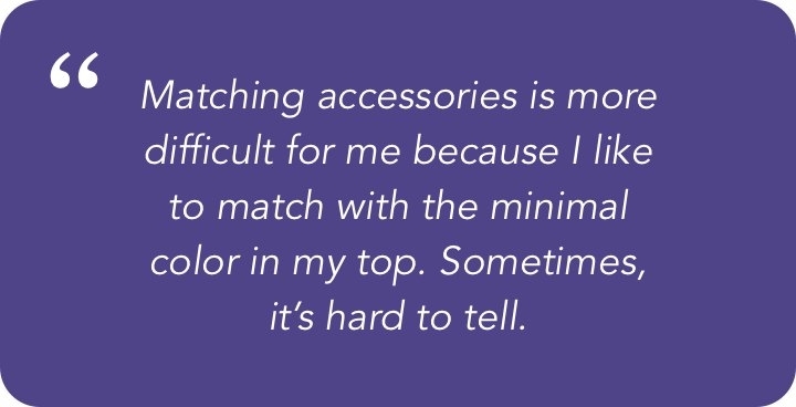


User's quotation from the interview
CO-DESIGN
Original design idea, Smart Closet was brought out to the user
We proposed the idea, Smart Closet with the participant in the co-design session. Smart closet was an app that would learn users' color combination preference first. After users digitalized their closets, the app would suggest the clothes for the users based on their personal preferences, both colors and styles. We walked through the idea with the user and she loved it! With the co-design session, we were able to verify some of our assumptions right away with the user. Co-design is the best approach to evaluate design ideas with user groups that are very different from us.
Design rationale is grounded in the color theory
The design rationale is based on the color theory, there are different types of color relationships, monochromatic, analogous, complementary, triad etc. The app will learn what types of color combo a person prefer to wear. For example, if the user usually wears top and bottom in analogous colors, the app will suggest the combination in analogous colors.


1. Take a quiz - Take some simple quiz inside the app so the machine can know the preference for color combination.

2. Upload image - Upload the image of your clothes. The machine will identify the color and show it on the color wheel.

3. Recommendation - Based on the color combination preference, the app will recommend the clothes for you.
Findings from Codesign Session
- A simplified color wheel is sufficient for the user since she doesn’t care about the accuracy of the color.
- She doesn't like to do the quiz because it would remind her of her color-blindness.
- After selecting the top and bottom, she would like to select accessories, cosmetics, and shoes.
- Have the occasion labels such as daily wear, traditional, party wear.
- Have the comments of the clothes so she can remind herself (eg, the stain on the sleeve)
- Show the least worn clothes first to avoid repetition.
- Have the “view all” and “filter” feature so she can still choose clothes at her free will.

Photos from codesign session: sketching with the user / Big Paper & Bags of Stuff
DESIGN IDEA ITERATION
Refine ideas and make sure the app meets users' needs- using machine learning.
After the co-design session, we integrated some of her feedback to design the wireframes. For example, we added the ability to choose accessories, removed the quiz part. However, the problem was that if we remove the quiz part, how could the app know her preference? The machine learning idea was introduced here. Based on the user data uploaded (the photos taken by the user), the machine will identify and learn their preference. In this way, users don't have to take the quiz, the data will be more accurate, and users only need to take a photo of what they wear each day instead of digitalizing their closet all at once. However, the limitation is that the machine takes time to learn, so the very first month of using the app will be just building a dataset to train the app.

Wireframes based on the refined idea from co-design session
FINAL SOLUTION
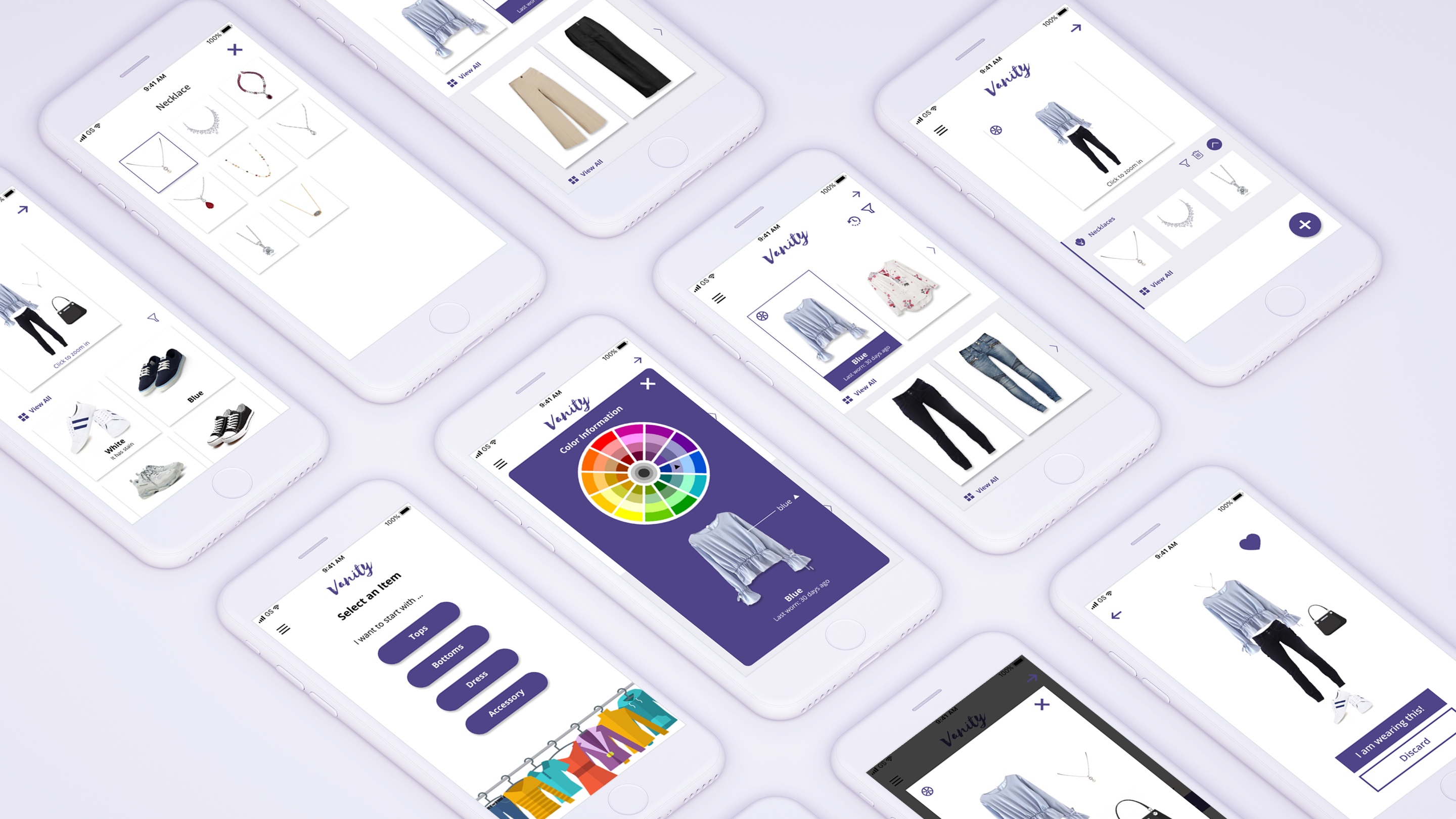
Vanity-how does it work?
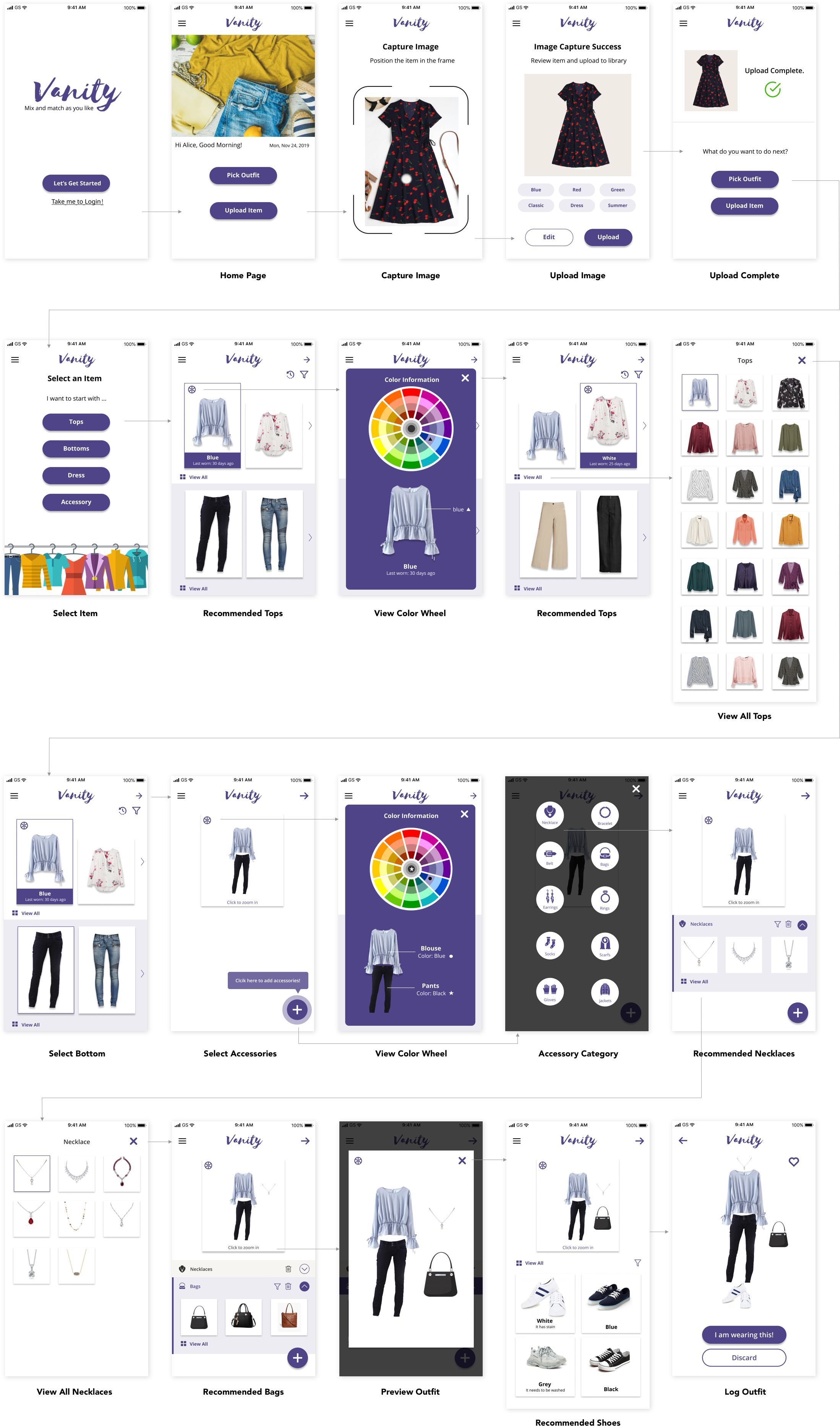
1. Upload Photos
- Capture the image of daily wear and upload it to the library.
- Auto-detect the colors, style, season of the outfit.
- Users can edit the information as they wish.
Design Rationale: Instead of asking users to take the color quiz for the app to know their preference, users can digitize their closet by uploading the clothes they wear every day. After a period of time, the machine will learn users' preferred color combination (eg. monochromatic, complementary) and style combination (eg. skirts or pants.)

2. Select Tops & Bottoms
- Select the top and the machine will recommend the bottoms based on personal taste.
- Users can filter and view all outfits.
Design Rationale: Our participant usually picked the top she'd like to wear and match it with the bottom. The flow matches the user's outfit selection. The app takes off the burden of choosing tops and bottoms by serving the least worn top first and recommending the bottoms that go well with the top as she doesn't like to wear the same top repeatedly.

3. View Color Wheel
Use symbols and the color wheel to provide additional information about the color
Design rationale: Show colors of the outfit on the color wheel using symbols as the participant usually memorizes the position to identify the colors. If the outfit has multiple colors, it will show the colors separately.

4. Select Accessories
Select the recommended accessories (necklaces, bags, earrings, gloves etc) and shoes after deciding the clothes.
- Users have free will to go through each category of accessory or skip.
Design rationale: Based on the interview, matching accessories is a big challenge for the participant since she has specific interests in matching accessories. After digitizing all accessories, the app can also suggest good choices just like tops and bottoms based on her preference.

5. View My Favorites
Save the combination of the outfit in "my favorites."
View the combination and last worn details in "my favorites."
Design rationale: provide an easy and efficient way for the users to quickly view what they have worn before in hectic mornings to avoid repetition and also allows users to quickly choose their favorite combo without going through the process.


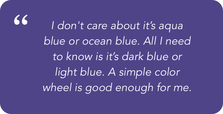

User's feedback from the usability testing
REFLECTION
Consider who might be left out when you design
In this project, I got a chance to learn how to design for people and design with people who are not like me. The essence of the inclusive design is to design for as many people as possible, to make it accessible regardless of age, disability or other factors. It's very important that designers always bear in mind who might be excluded at every design stage and think about how they can engage. In this way, the products/ services could be extended to everyone.
Although the project is focusing on only one participant with color-blindness, the solution we proposed is not limited to color-blind users. Anyone has a problem choosing what to wear could benefit from the app. However, if time allows, we would like to interview more color-blind users and see how they typically choose their outfit combination to come up with a more complete solution.

Other Projects
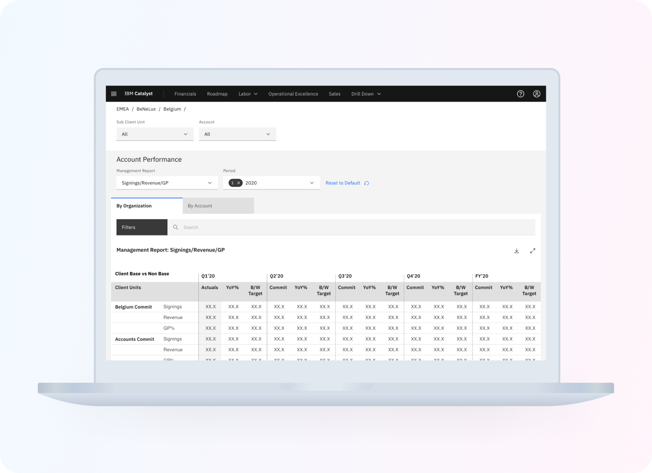
IBM Catalyst DesignUX research . UX design
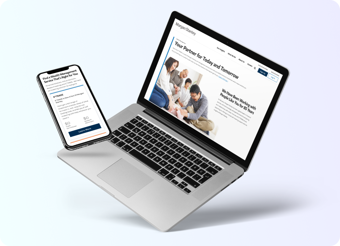
Morgan Stanley Website RedesignUX research . UX design
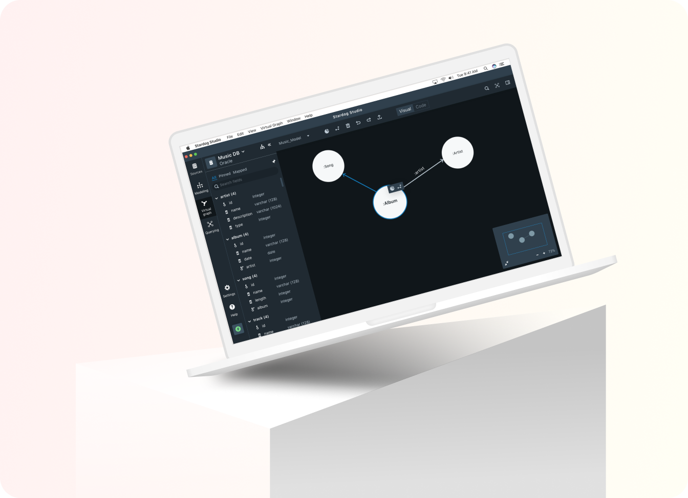
STARDOGUX research . UX design

USA TODAYUX research . UX design

P & GUX design

PAIRUX research . UX design

VANITYUX research . UX design

LUCAS BENITEZVisual design . Motion design
