P&G
REDESIGN THE SUPPLIER E-LEARNING WEBSITE
This is a design challenge for Procter & Gamble. We won the first prize for the challenge!
P&G deals with 90,000 suppliers globally. However, their current website for suppliers to manage account info and orders are not effective enough for them. Based on user pain points, we redesigned the website for P&G suppliers to easily get trained for different tools and to better access the tools they need.
Type:
Makeathon Design Challenge
April 2019 (2 weeks)
Teammates:
Airy Liu
Yirang Choe
My Roles:
Persona
Ideation
Hi-fi Prototypes

DESIGN PROMPT
How to make a supplier e-learning site that will effectively train our suppliers on SPPO tools?
Procter & Gamble deals with 90,000 suppliers globally. These suppliers manage account information, order and invoice through different Source Plan Pay Operations (SPPO) solutions. Some suppliers need guidance on how to use them so training needs to be given. Their learning experience should be digital, easy and effective.
DESIGN GOAL
Create solutions that help users to find tools effectively to increase the engagement rate of new users and the satisfaction rate of current users.
Based on research, we found that there are different types of suppliers, some are new to P&G and some are old and expert users. The goal is to create an overarching platform that both user groups can use it together and increase the engagement rate of new users and the satisfaction rate of current users.
Persona

FINDINGS
Identify major problems on current website


Some issues with the current website are as below, which leads to the users' pain points.
- Every tool is laid out randomly without any hierarchy or order.
- There is no instruction on each tool so new users could get confused about what it is and what it does. Old users could also have problems if they haven't used it for a while.
- There is no FAQ or help page.
- There is no global language support. Suppliers who had difficulty understanding English would suffer.
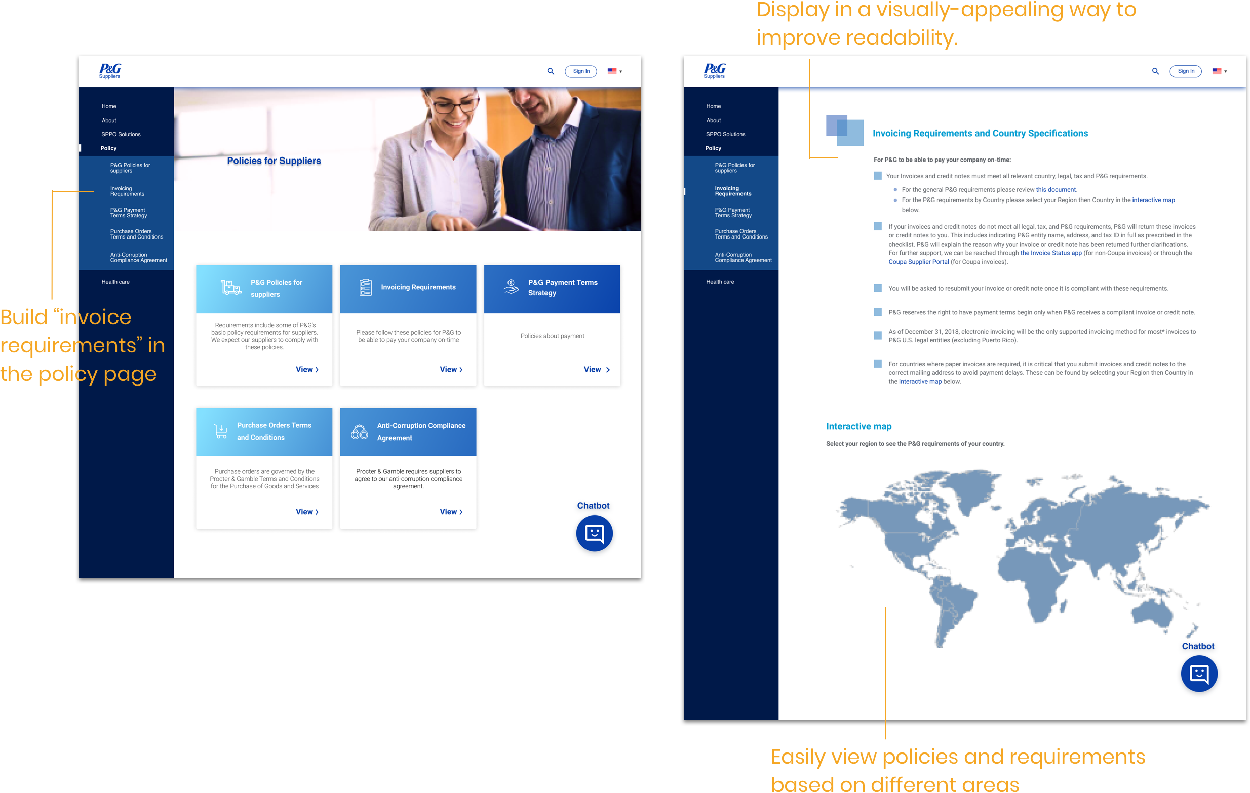
- The policy page is too text-heavy and lowers the legibility.
Unclear information architecture
The current website distributes the users based on their experience level, for example, "prospective suppliers", "new suppliers" or "current suppliers". However, the subsections inside the "current suppliers" are not organized and makes it difficult for the users to find 2 main contents they need, "Tools" & "Policy"

Undelightful user journey
Both new users and old users have an unpleasant journey when travel through the website to achieve their goals.

Design implication
- Provide a clear hierarchy of the information/ tools displayed on the website.
- Help suppliers from different countries to easily learn how to use SPPO solutions to manage account information, manage orders, and manage invoices.
The digital content should be easy to understand which can enable high participation without making the training too burdensome for them.
Provide Help & FAQ so that users can find the answers.
Inform suppliers about the upgrades or changes of the tools.
FINAL SOLUTION
Redesign information architecture and make the important info more prominent.
The new information architecture has a flattened structure. It's easier for users to navigate. We elevated the level of "SPPO solutions" and "Policy" due to its frequency of use. In this way, users can get there frictionless.

Home Page
- Based on the new information architecture, we created a vertical navigation bar for users to easily switch between tools and navigate
- Provide chatbot for users to find the right tool and policy
- Provide different landing page for new users and old users. A step-by-step onboarding guide will be displayed for new users while recently-used tools will be displayed for old users at the top.
- Support different languages.

Policy Page
- We created a new page for the invoice requirement and build it into the policy page which is more similar to users' mental model.
- Recognize different policies to help users easily find the needed policy & requirements based on different areas.
- Display the policy in a more visually-appealing way that improves legibility.

Solution Page
- Categorize tools by their functionalities.
- Show functionalities, credentials, recently used & updated status of each tool.
- Provide easy access to tutorials of each tool.

Tutorial Page
- Provide step-by-step tutorials for each tool.
- Each accordion menu represents tutorials for different features.

KEY DESIGN DECISIONS
Side navigation bar
- Side navigation bar provides more space if there are multiple sections, or if clients need to add more sections in the future.
- Side navigation is easy for users to switch between different contents/ tools.

The display of tool page
The old design is either unsustainable or not visually appealing.
The new design uses different tabs to organize the tools and provide shortcuts so users can navigate to the tools they want quickly.

REFLECTION
The information architecture is very important for users to find the correct information.
When I first saw the website, I found it hard for me to get the information I need. One of the most urgent issues with the initial website was that it didn't have a clear hierarchy. The information was scattered and the architecture was pretty messy. Users struggled to find the information they were looking for. It was even harder for them if they haven't used it for a while. Therefore, to clean up the information architecture and improve the memorability became the top priority.
Although this project is an agile design challenge without us doing research from scratch, I would suggest always take one step back and stand in user' shoes before jumping into detailed design. Thinking about the user journey for both new users and old users is really helpful to make sure that users' problems are all correctly addressed. The next step is to test the hi-fi prototype. We didn't test our design due to the timeframe, but the validation is needed to make sure the design is easy to understand.

Other Projects

IBM Catalyst DesignUX research . UX design

Morgan Stanley Website RedesignUX research . UX design

STARDOGUX research . UX design

USA TODAYUX research . UX design

P & GUX design

PAIRUX research . UX design

VANITYUX research . UX design

LUCAS BENITEZVisual design . Motion design
