LUCAS BENITEZ
VISUAL DESIGN FOR A MUSIC WEBSITE
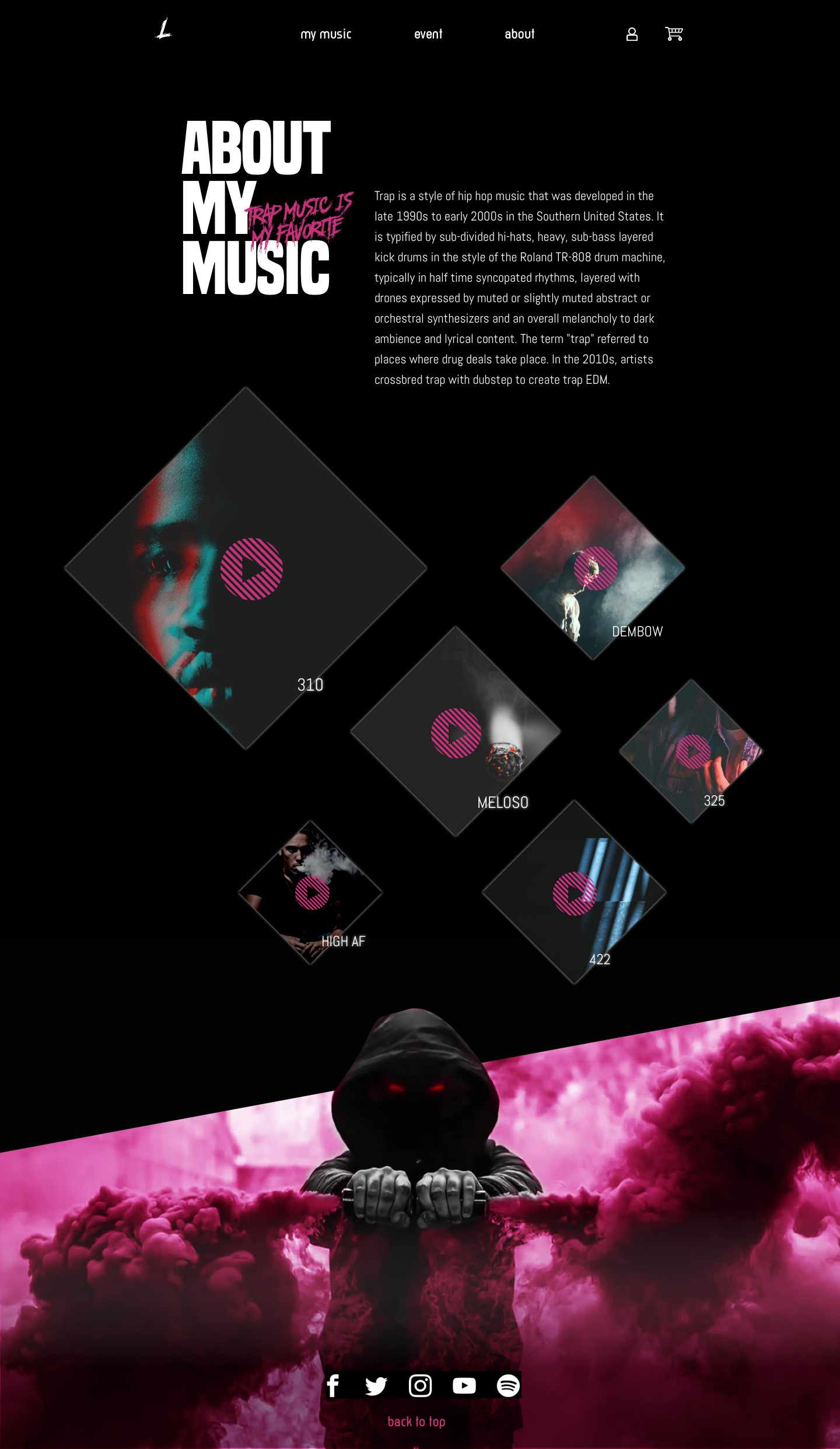
This is a website designed for my friend, Lucas, who is a music producer. He wants to sell his music online and gets more people to know him. The website relies heavily on visual design, which speaks to the mission statement, also topped with the animation to strengthen the feels and experience.
Type:
Course project
Apr-May 2019 (3 weeks)
My Role:
Visual design

MISSION STATEMENT
How to design a website that speaks about himself and his music to get more people buying his creation.
DESIGN STRATEGY
1. Build an E-commerce/portfolio website
The website should be easy to use for users, provide clear steps to purchase music and listen to free trials. His personal profile will also be included in the website in a visual language that shows the most of him.
2. Convey the dark energy
The music type he creates is called trap music, which is originated from Southern hip-hop. To create the dark ambiance, the themed color will be saturated black but contrast with bright colors, such as hot pink or blue. The website will include some typical elements from the street culture such as graffiti, smoke grenade, guns, drug houses.
3. Display the disorder of beats
One of the characteristics of his music is that there are lots of beats made by different instruments. I would like to use the images and elements reflecting the disordered, unsafe and a bit mischievous feel to create the tension, such as breaking girds, overlapping images, unaligned texts.

WEBSITE SCREENS
MOBILE SCREENS
MOCKUPS
DEMO
REFLECTION
A visual designer is also a UX designer.
I really had a great time exploring and playing with different ideas. However, even with some crazy visual ideas, the goal to make the website user-friendly should always be borne in mind. When I designed, there was always a sound in my head saying, "keep the button larger or make enough contrast." I tried to follow the knowledge for better user experience while keeping the aesthetics of the design as I wish. It's not easy but they are not conflicting. The question is to strike the balance.
Other Projects

IBM Catalyst DesignUX research . UX design

Morgan Stanley Website RedesignUX research . UX design

STARDOGUX research . UX design

USA TODAYUX research . UX design

P & GUX design

PAIRUX research . UX design

VANITYUX research . UX design

LUCAS BENITEZVisual design . Motion design


