PAIR
EXPERIENCE A REAL CONNECTION
In this project, we were trying to understand how design could help to improve human's mental health by solving the loneliness problem. Our target users are Ph.D. students. We did the user interview, diary study, and focus group to understand their problem and validate ideas. We proposed a Ph.D. matching app as a solution for them to meet new people, make a deep connection and alleviate loneliness.
Type:
Course project
March-May 2019 (10 weeks)
Teammates:
Modassir Iqbal
Yirang Choe
My Role:
UX research
Product design

Video Prototype
DESIGN GOAL
Create a design solution that helps alleviate the feeling of loneliness among Ph.D. students.
Ph.D. students are usually under lots of pressure finding research topics, doing research, being TA and managing tasks assigned by the professors. Normally, they have to handle it all by themselves as it’s a field of high profession. Shifting from collaborative college settings to individual self-sufficiency, they have a hard time finding the right person to talk about their trouble on research and cause the feeling of loneliness. Based on the survey we did, over 1/3 of the Ph.D. students rated themselves as moderately high lonely.
Therefore, the project goal is to create a design solution that helps alleviate the feeling of loneliness among Ph.D. students, so that they could have better mental health and work-life balance.
Based on the survey, 36% of Ph.D. students have moderately high loneliness scores; 90% of them are in their 1-2 year of Ph.D. and 90% of them are single.
The survey was sent out to 440 Ph.D. students in different schools at UMD with 10% response rate.
USER RESEARCH
Interview & diary study help us understand users’ frustration and expectation
We started the research with the screener survey and we identified 6 participants to conduct interviews with each of them. The age of participants ranged from 20-45. Their UCLA loneliness score ranged from moderately lonely to moderately high lonely. To gain in-situ data, we also asked the participants to document the moments that would affect their emotional state through diary study. Through the reflection of their day, we could see the vivid and subtle examples which helped us empathize and synthesize all data.
One of the main findings was that the reason Ph.D. students struggling with the feeling of loneliness came from many aspects of their life but mostly came from a lack of real and deep connection with their colleagues, friends, or families. They wished they could have someone supportive and understanding by their side when they stumbled on their work and life.


different themes generated from affinity diagrams
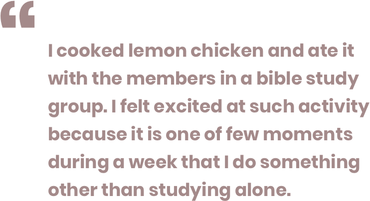
Lots of work regarding research, study, meetings also make Ph.D. students tend to do things by themselves, even when they were not at work. For example, go grocery shopping, go to movies or doing exercise. There were only few moments in a week that they would gather with their friends.
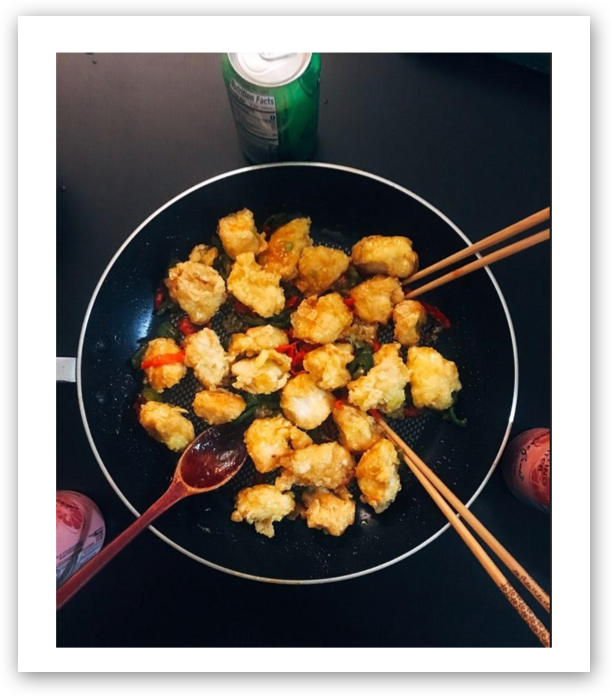
Photo from diary study, lemon chicken
KEY FINDINGS
Identify the major problems and design implication

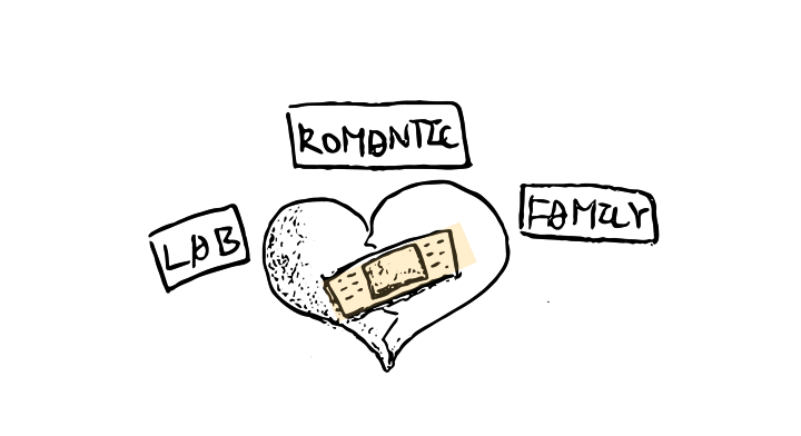
1. Their feel of loneliness came from various aspects, including stress from work, lab, class, lack of romantic relationship, estranged families, comparison with peers, and mostly came from a lack of real and deep connection with their colleagues, friends, or families.
Design Implication: Improve/ build a deep connection with families, friends, romantic relationships, colleagues and classmates through meaningful conversation. A supportive significant other is very important.


2. The quality of interactions is more important than the volume. Ph.D. students told us that they would rather have one true friend who they knew he would always be there for them instead of 10 who they didn't want to turn to.
Design Implication: The amount is not important. Reduce trash talk and small talk. Improve the quality of the interaction to form deep and real connections.


3. Excessive workload & lack of opportunity keeps them from making new connections. They didn't have time to join the social events held for graduate students. Some of them only met new people on the orientation day of a new semester or in a new class.
Design Implication: Provide a quick and convenient way for them to meet new people and connect with people easily in small chunks of time. The idea of mobile app was emerging as they usually carry their cell phones.


4. Time is valuable for Ph.D. students because they're very busy. They wanted their time to build up a relationship to be invested efficiently, or they would rather stay alone, However, they admitted it's a virtuous circle.
Design Implication: Provide a way for Ph.D. students to meet and make friends with the people they’re interested in.


5. Ph.D. problems are very specific and can only be understood by people who have ‘been there.' For example, Ph.D. students/ professors.
Design Implication: A Ph.D. community or forum where they can discuss or talk about ups and downs in their research and life of high-education.

Persona
DESIGN IDEA IETRATION
Solution 1: Connection App - Failed : (
Our initial idea is an app that helps Ph.D. students to connect with their friends and families more deeply. By providing interesting prompts and topics in the chat room, we assume that users can have more meaningful interactions and talks with their friends and families, which leads to deeper connections. The users can also share their deep feelings or negative thoughts anonymously to get real feedback from their friends/ families.

1. Show your true self - Change emotional status and update news to closest circle.

2. Talk often - Use conversational prompts based on user preferences on chat rooms.

3. Share deep feelings - Share self deep or negative feelings to your inner circle anonymously at your wish.
Why did it fail?
However, after we did the low-fi paper testing, we found that it did not really touch the points of solving the problems that Ph.D. students faced. The main reasons included
- Users don't need prompts to talk with their inner circles of friends and families.
- Group and individual dynamics for close relations are usually set before they use the app. We could not improve the connections that were already saturated.
- Even anonymous, close friends/ families can easily guess who's the author by the content posted.
- The app is not for Ph.D. specifically - this made all the difference. The Ph.D. students who tested our app repeatedly reminded us that their problems are very specific and they are not always able to share those even with their closest friends. They wanted something to feel and breathe Ph.D. so they would not hesitate to share their daily frustrations and workload problems with other users on the app.
Solution 2: PhD Matching App (PAIR) - Succeed : )
Based on the feedback we got from our participants, we quickly tossed our first idea as the direction is wrong. We brainstormed other ideas and kept referring to the insights from the research. This time, we also shared the idea with a focus group of 7 Ph.D. students. Through a quick validating session, we learned that most of them were interested in the concept, a Ph.D. matching app, which helps Ph.D. students to find new connections easily, converse with people without burdens and build up the relationship through gamification. Ph.D. students can also create meet-ups in the community.

1. Build up their own public and personal profiles - Users can view and connect with other Ph.D. students, whose profiles will be opened up every day in the matching page (15 maximum per day)

2. Prompt Messages - Students can send the message to their connected people or using the prompt that will help them start and continue the conversation more easily.

3. Gamification - Users can reveal their personal profile gradually once they achieve certain amount of conversation. By viewing their pair's personal anecdotes, both parts would be more engaged in the conversation and hence develop deep connection.
Why does it succeed?
Ph.D. students have trouble finding and connecting with new people - This was one of the main reasons our idea worked. Ph.D. students commented that they were mostly isolated, while the app provides a way for them to meet new people in their free time.
- Ph.D. students can find someone with the same goals as them efficiently. Giving them detailed professional profiles to view and enabling them to outline their goals for using this app like ‘dating’ or ‘finding research mentors’ made sure that they could filter out and match with these exact kinds of people.
- Gamification & Reveal: the feature caught our users' attention. The feature allows users to take off the burden of sharing new details and prompting exploration of each other's life, which resonates with our goal to improve the "quality of connection." It's a less intrusive way to show their personal stuff and query others.
- The app is Ph.D. specific, allowing them to meet other Ph.D. students, who understand how they've been through and how they feel to be a Ph.D. student. They were excited about connecting with new people, discovering new Ph.D. things and making and joining smaller communities.
- Quantitative findings- we asked our participants to rate the ease of use for the app using the Likert scale. The final average of the score is 1.54, very positive. (1 is very easy and 5 is very difficult)


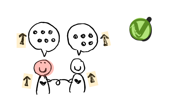

Users were doing low-fi usability testing.

FINAL SOLUTION
Pair, a Ph.D. matching app that helps Ph.D. students easily connect and build up relationships with someone just like them.
Based on the positive feedback from low-fi usability testing, we proposed the final solution, Pair, a Ph.D. matching app. It's a mobile app that allows Ph.D. students to find new connections based on their preference, converse with people without burdens and build up the relationship through gamification.
The initial idea included a Ph.D. community in the app that they could build up their own groups and meet-ups. However, due to project scope and time concern, we decided to focus on the most critical features as a MVP and not to move further with the community idea.
We also created the style guide for the visual design of the app. The colors, fonts, buttons, icons, status were all defined before we started the hi-fi prototypes.
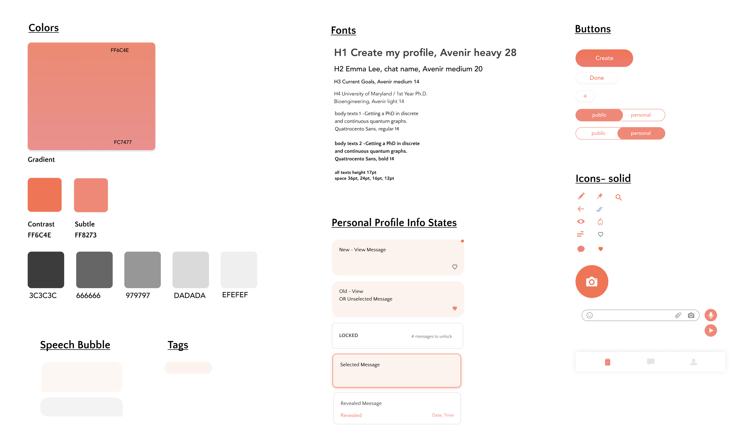
style guide


Visual design iteration
How does Pair work?
1. Create Profiles
- Fill out basic details to the public profile. (including school, research area, etc.)
- Set up the goals to find proper Pairs. (including find mentors, make new friends, etc.)
- Upload CV from the device or import it from Linkedin. (including published paper, attended conferences)
Validated Assumption: People don’t want to spend a lot of time making profiles.

2. Edit personal profile
- Add information to the personal profile that you can reveal to your Pairs.
- Provide default questions that are interesting and impressive. Users can customize their own questions.
Validated assumption: Ph.D. students don't want to say anything too personal when they meet new people, but they also need a way to talk about themselves besides research topics. The personal profile is a fun and personal story room they can choose to reveal to the people they trust later.

3. Pair with people
Use Match Settings to filter your exploration.
View people’s public profiles. (eg.Interests/ Goals/ Research Details.)
Validated Assumption: Ph.D. students care about the research details of people they find.

4. Start conversation
Use smart prompts for easier conversations.
Validated Assumption: Some Ph.D. students are introverted and feel difficulty in conversing with new connections.

5. Reveal Profile
View information that your Pairs have revealed for you.
Add, choose and reveal information more relevant to your Pair.
Validated Assumption: Building new connections needs to be fun and should take away the burden of revealing new information to people you trust and like.


REFLECTION
Test your ideas as early as possible
The most important takeaway from this project is to validate the ideas as soon as possible. Our first idea is the connection app which helps Ph.D. students to improve their connection with friends and families. When we tested the low-fi paper prototype with Ph.D. students, we found that it didn't work for them. It was not efficient and it was simply not effective since it was not Ph.D.-specific.
I'm glad that we tested it at an early stage and figured it out right away that it's not the best solution. We quickly had a focus group with Ph.D. students and brought up some other ideas. The Ph.D. matching app won the most claps and we developed from there. This project re-iterated the importance of validation in the early design phase to provide solutions that really serve users' needs.
The further step includes testing the high-fi prototype, validate that the features and set up metrics for unlocking reveals and iterate from the findings.

Other Projects
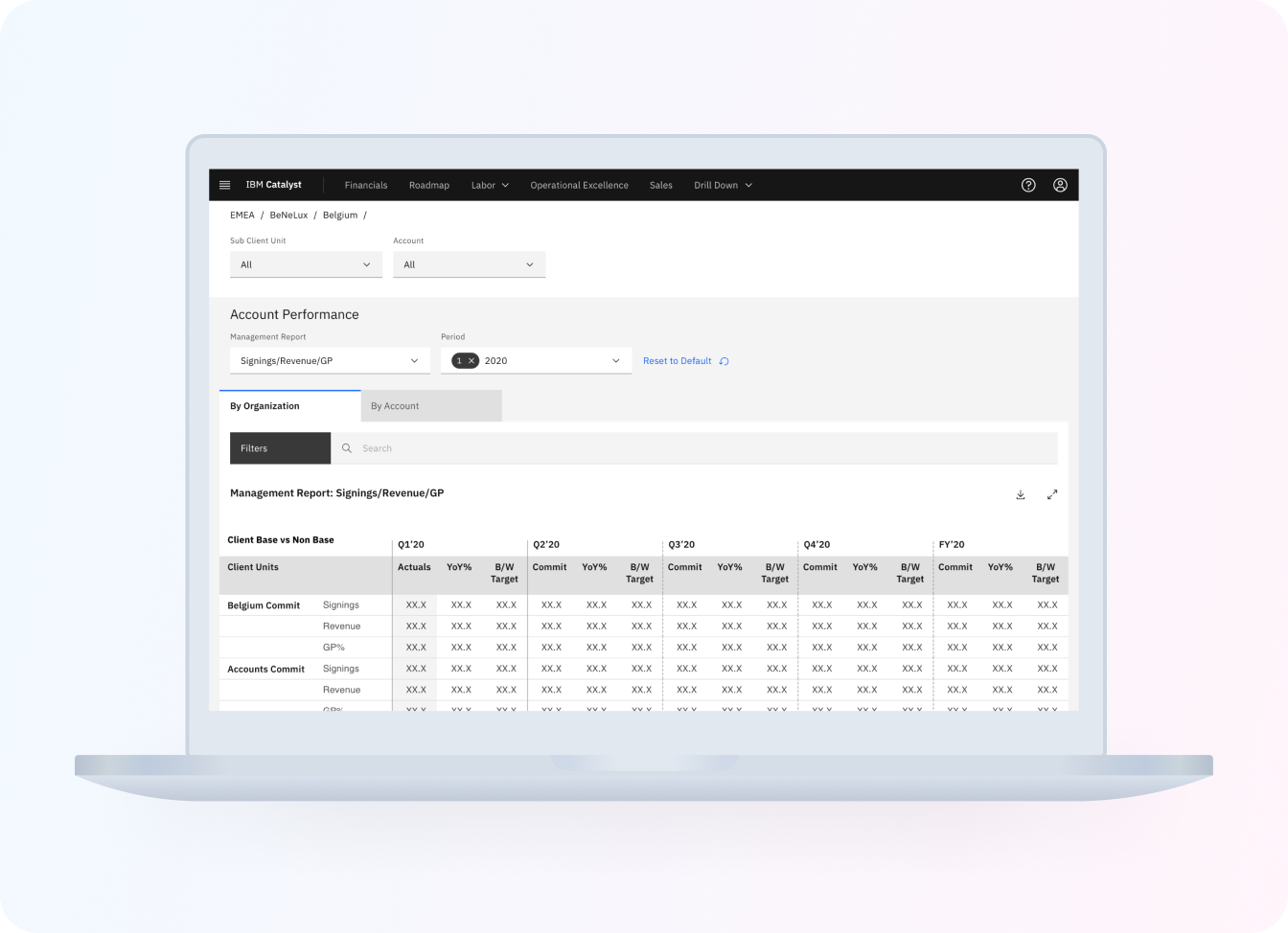
IBM Catalyst DesignUX research . UX design

Morgan Stanley Website RedesignUX research . UX design
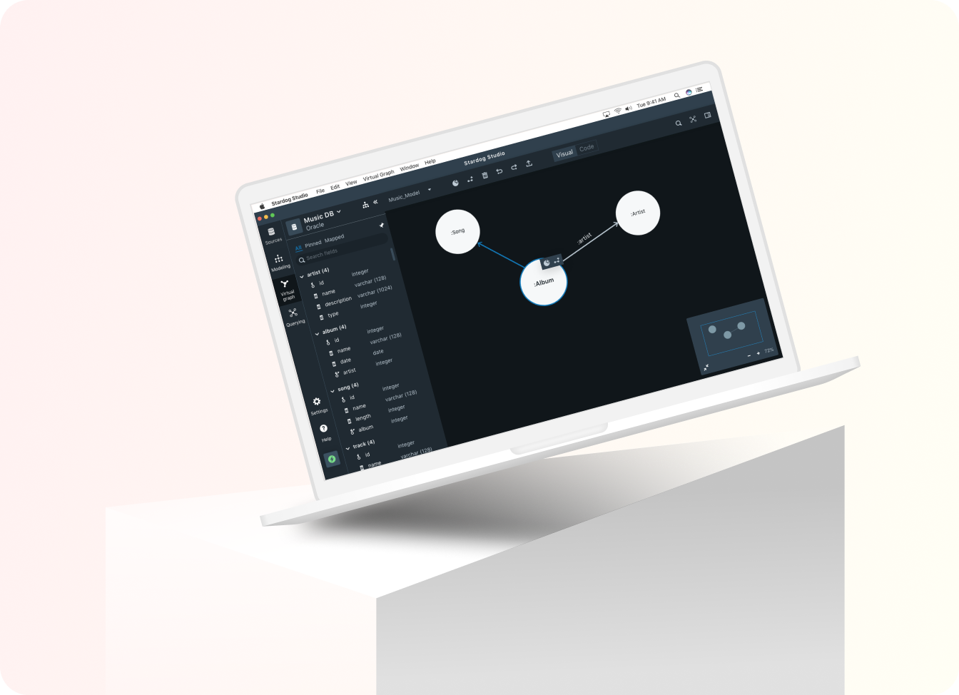
STARDOGUX research . UX design

USA TODAYUX research . UX design

P & GUX design

PAIRUX research . UX design

VANITYUX research . UX design

LUCAS BENITEZVisual design . Motion design
