NEWS LENS
GET THE NEWS RIGHT IN FRONT OF YOU
This is an intern project that I worked on when I was a UX Design Intern at USA TODAY NETWORK in summer 2019.
In this project, we were trying to envision the news experience in the future and explore the solutions to accommodate our future readers. We proposed News Lens, an engaging way for people to get the news right in front of them based on object recognition and geolocation.
Type:
Intern Project
Jun- Aug 2019 (10 weeks)
Teammates:
Clare Mahr
My Contribution:
Research/ Ideation
Low-fi & Hi-fi prototypes
Video prototype
Usability Testing
Tools Used:
Sketch
InVision Studio
After Effects
Usertesting.com

PROBLEM STATEMENT
How might we anticipate and envision the news experience of 2030?
As user preferences shift, the USA TODAY Network must shift product strategy and design with them in mind. If current trends hold, news consumption habits in 10 years will be significantly different. How might we anticipate and envision the news experience in ther future?
DESIGN GOAL
Explore solutions that will effectively engage users in news consumption in the future.
Create solutions that will bring more GEN Z users to read our news stories and raise the engagement and subscription rate of news under USA TODAY Network.

RESEARCH FINDINGS
Understand people's current news consumption habits
We conducted both surveys and interviews to understand our target audience's news consumption habits. We sent out the survey to over 400 people between 15-25 and got responses from 52 of them. Based on the screener survey, we selected 6 participants to conduct interviews. Their age ranged from 18-23 and all of them were students.


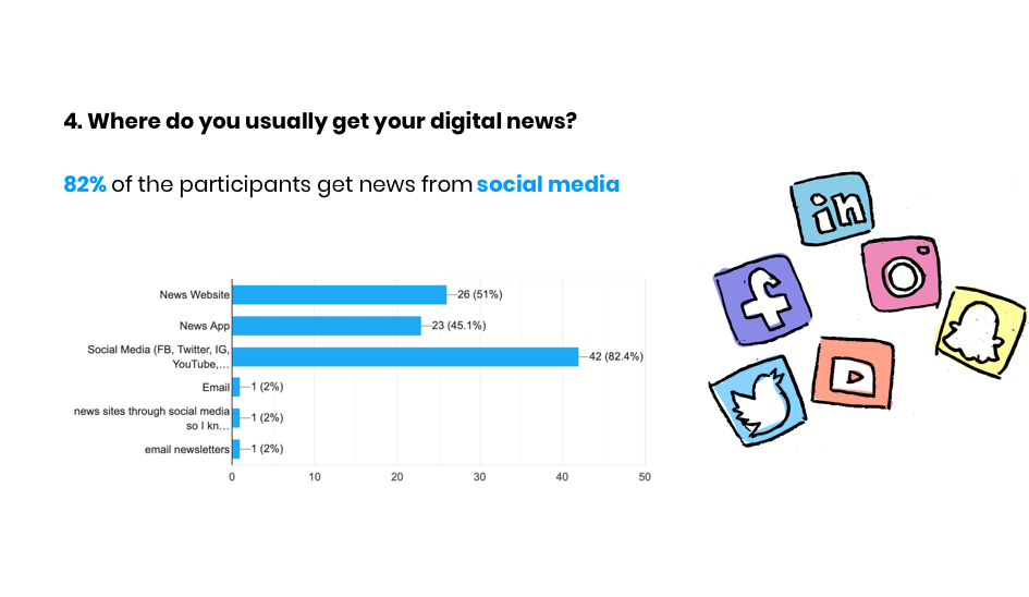

What users like and dislike implicates a new way for future news consumption.
News experience should be frictionless and fast.
- People’s habit in checking news is within a very short time and intermittently during a day.
- Want to be able to consume news quickly/ easily with the ability to dive deeper if they want.
- They like news mixed throughout their daily content, just like when they scroll through their social media to get news, see the upcoming events etc.
I want to read news in interesting and fun way.
- People want their news consumption experience to be fun, interesting and interactive.
- They imagine in the future, AR and VR will be prevalent and change the way people read.
Reading news makes me informative and knowledgeable.
- They read the news because they can be more informed, be aware of the problems and think critically.
- They like to share the news with family and friends because it keeps them close.
- The truthfulness of the news and easy UX are important.
Design implication
News should be unobtrusive and blended in their daily content.
Collaborate with social media to get more exposure.
News should reiterate its value as informative and inspirational.
Integrate with AR technology to make the experience of reading news more interesting and interactive.
Provide news in the format of article so that they can easily and quickly skim through.
FINAL SOLUTION
News Lens allows users to view news quickly, frictionlessly and interactively with one click.
We proposed News Lens, a way that users can get the news right in front of them by scanning the object of interest. They can also view the trending posts of the objects or nearby areas from social media, view recent events and learn news stories from the past.

Scan the object
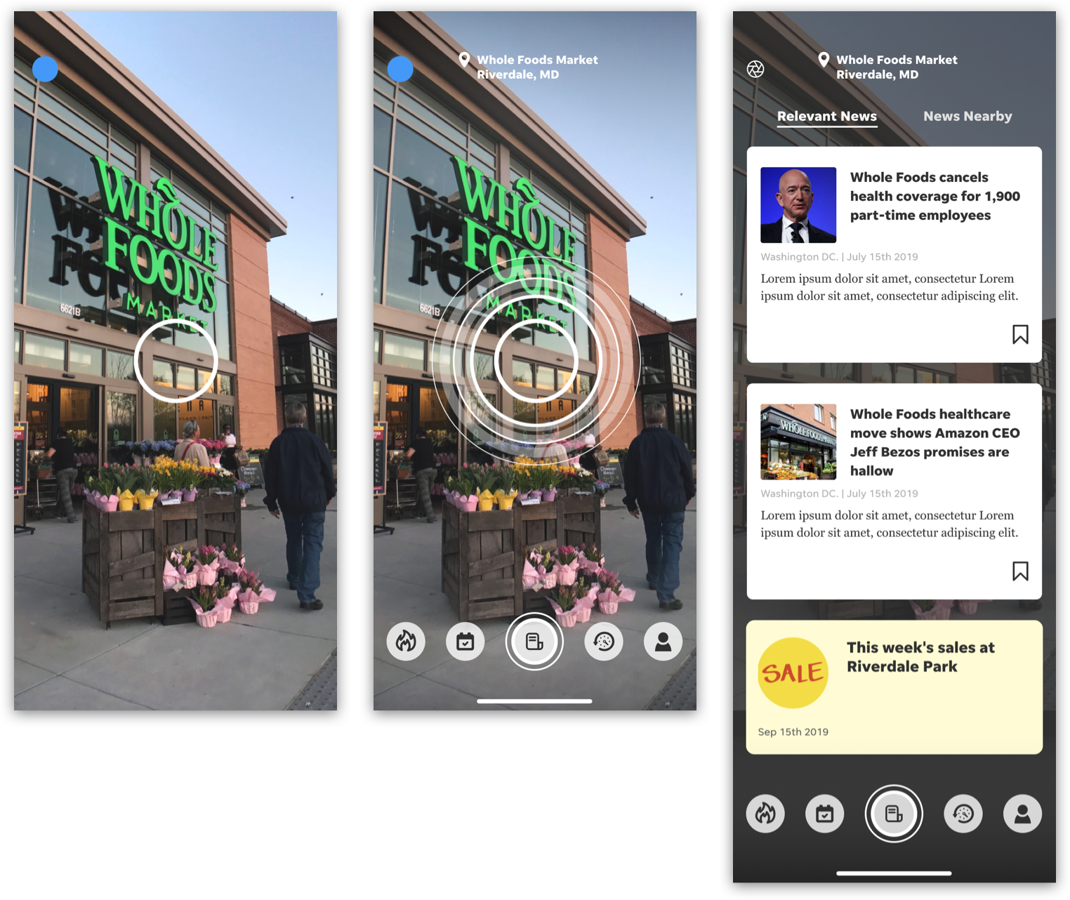
- Scan the object. Once the object is detected, its name will show on the top, users can tap on the different buttons on the bottom bar to get different contents, eg news, events.
- Users can get the news based on the object scanned or their current location.
- Error messages will show if there are multiple objects being detected or the system can't identify the object.

Read news story
- By tapping on each news card, users can view the news stories.
- AR mode will be turned on if they tap "Bring this story to life."

AR
- The app will serve AR news. In this example, the projection of the rocket will be displayed on the Monument that they scanned. (It was celebrating the 50th anniversary of the launch of Appollo 11!)
- Users can zoom in and out to view the news and interact with the astronaut.

Hot posts & Events
- Users can use the navigation bar at the bottom to navigate between different sections like trending posts and tweets based on the object.
- Users can view recent events based on the location.

Historical news
- News stories in the past will be served based on the object and location.
- Users can view the news stories by tapping each news card.

Other use cases
- If the building is a commercial space, it will serve the deal info for the users.
KEY DESIGN DECISION
1. The layout and content of the news card


Version 1:
Only shows the news headline
Version 2:
Shows both headline and first sentence of the content
Version 3: (Winner!)
- Shows both headline and first sentence of the content
- Add an icon for AR news to make it more understandable and eye-catching
- Add save icon so users don’t have to go to the detail page to save for later
- Reduce the spacing to save real estate of the screen.
2. The display of the news card


Version 1:
There is no differentiator between news based on the object or news based on the location.
Version 2:
- Add the title of the page.
- News based on the location comes first and followed by news nearby. However, users need to scroll down to get to the news nearby.
- If they want to see more news, they need to tap the title
Version 3: (Winner!)
- Use tab for users to navigate between sub-sections.
- Infinite scroll of the news, no extra tap is needed.
3. The navigation and the information architecture

Version 1:
There is no way for users to go back to USA TODAY app.
Version 2:
- Add USA TODAY logo on the top left.
- If users want to go back to scan mode, they have to tap the middle button with lens icon to back to the news section and tap back button on the top left to go back to the scan mode.
Version 3: (Winner!)
- Refine information architecture.
- Add the lens icon on the top left for each section, reducing 1 extra tap. Users can go directly from each section (posts, events, archived news) to scan mode.
- Change the icon of the middle button to represent “news” instead of “scan” to reduce confusion.


VALIDATION
Conduct usability testing to test the concept
We conducted usability testing with 6 users and received very positive feedback. Users like the idea of using camera to get the news and they also like the idea of reading news through AR.


THE IMPACT
Build a MVP that lives within the current app
Product team loved the concepts that we proposed. The idea kept iterating after the summer internship was over, and we were trying to build a MVP that lives within the current local app, Cincy Sports Catchup, where users can see the news served to them based on the location.

REFLECTION
Think about the desirability, viability, and feasibility.
A product is not only about desirability but also viability and feasibility. When exploring different solutions, we didn't think deeply about the other 2 aspects and made the initial idea under a huge scope that users could perform different types of tasks (including scan objects, read news, generate contents, find events. etc) However, when building a MVP, we have to consider what the main and sufficient features are for early adopters based on viability and feasibility as well. The concept of using geolocation to serve news became the first priority in the MVP.
I enjoyed working on this project during my internship. I learned a lot from this end-to-end experience by talking to my manager, mentor, and other designers. They are awesome people and I truly appreciated the opportunity to work with this amazing team in USA TODAY NETWORK.

Other Projects
IBM Catalyst DesignUX research . UX design
Morgan Stanley Website RedesignUX research . UX design
STARDOGUX research . UX design

USA TODAYUX research . UX design

P & GUX design

PAIRUX research . UX design

VANITYUX research . UX design

LUCAS BENITEZVisual design . Motion design
