STARDOG
DESIGN A VISUAL EDITOR FOR DATA MAPPING
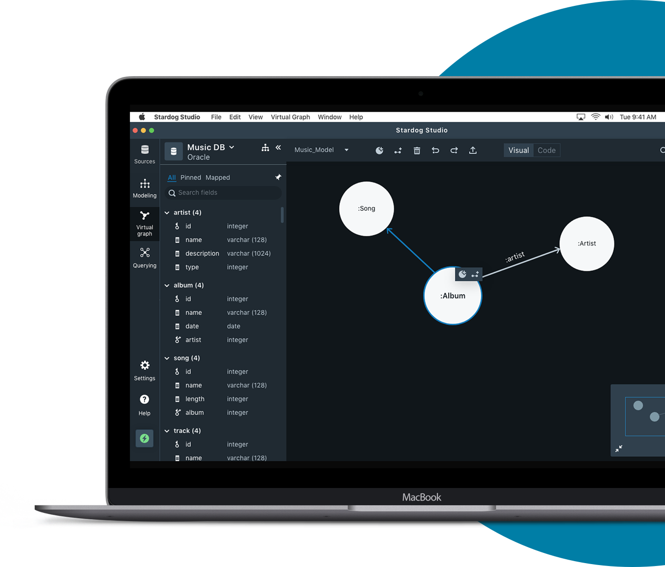
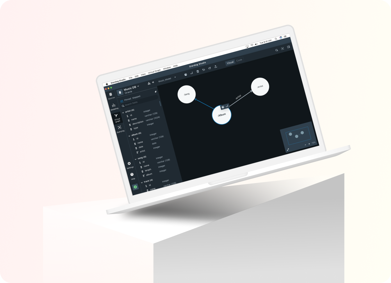
In this project, we've built a graphical user interface for non-technical people who have limited knowledge in coding to do data modeling and data mapping. The current process of data modeling, mapping, and querying can only be done by writing code. However, to expand the customer base, we designed a tool that could bridge the gap between technical users and non-tech users so that both parties can easily work on projects and maintain the knowledge through the tool.
This is the capstone project worked by the UMD team partnered with the company, Stardog, a leading knowledge graph platform for enterprises including NASA, CapitalOne, Dow Jones, and Bank of America.
Type
Capstone Project
Sep 2019 - May 2020 (8 months)
My Contributions
Research/ Ideation
Low-fi & Hi-fi prototypes
Usability Testing
Teammates
Aravind Jembu Rajkumar
Jashan Gupta
Modassir Iqbal
Monikka Ravichandran
Yirang Choe
Tools Used
Figma
Adobe XD
BUSINESS GOAL
Expand the customer base to non-technical people.
Knowledge Graph building process includes collaboration between different teams, including high-techies and low techies. Design a visual tool that could be used by people with different levels of expertise in coding to expand the customer base.
PROBLEM STATEMENT
How might we design a tool that helps users with limited technological expertise and skills to do data mapping?
The current Knowledge Graph building process is sufficient for engineers who are experienced in writing code. However, it’s too difficult for non-technical users, such as SMEs or business analysts, who would be helping to design and build a knowledge graph. How might we design a tool that helps non-technical users to engage more in the process?
BACKGROUND
What is Knowledge Graph?
Knowledge Graph is a data management tool that connects all data, data sources, and databases of every type. Enterprise data is usually stored in different data silos, which failed to provide insights because they’re disconnected. Building a knowledge graph help to connect all enterprise data and answer questions.
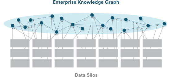
source: stardog website. https://www.stardog.com/how-it-works/
THE IMPACT
Stardog is going to implement the product based on the insights, design outcome, interaction patterns, and component library.
Our client is very satisfied with the final deliverables. Although there are some advanced use cases not considered due to project scope, they’re using our design as the starting point to build the visual editor, and we can’t wait to see the result!
THE OUTCOME
A Graphical User Interface for data modeling and data mapping.
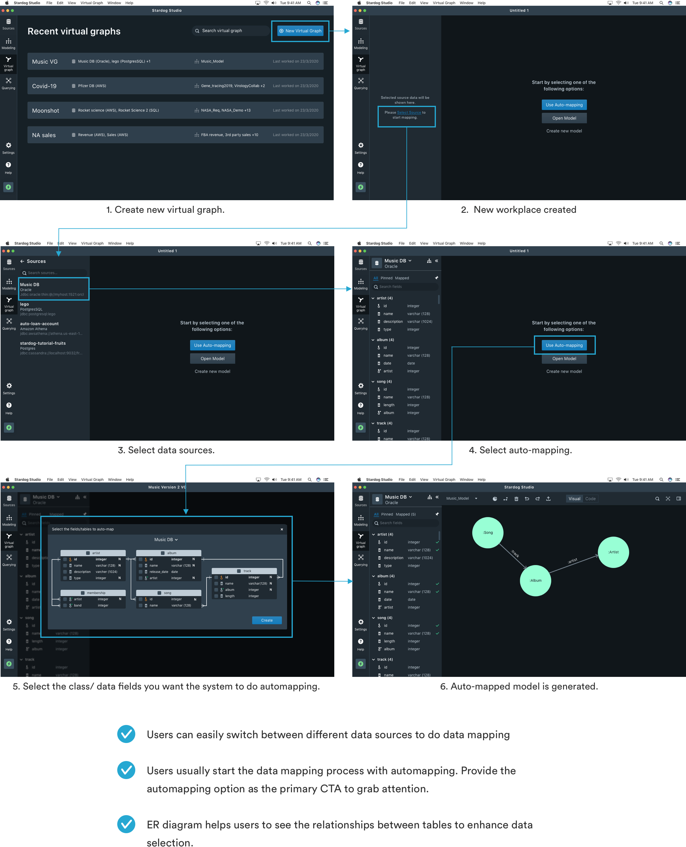
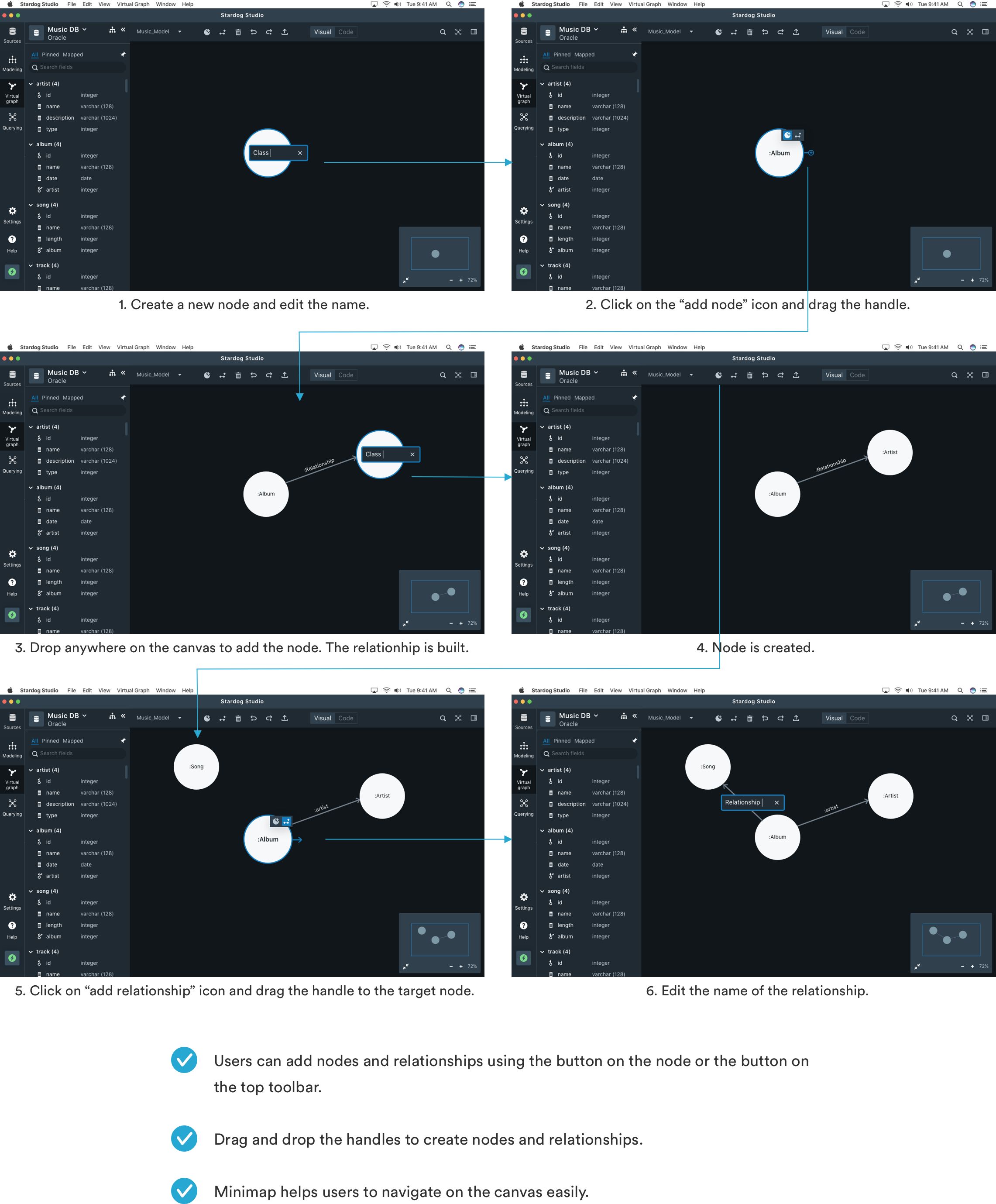
Below is the prototype walkthrough. It contains mainly 3 parts, automapping, data modeling and data mapping.
The flow for creating new virtual graph + automapping
The flow for data modeling
The flow for data mapping
So, how do we get there?
USER RESEARCH & FINDINGS
Understand the current process of building knowledge graphs, use cases, and pain points. Brainstorm ideas based on research findings.

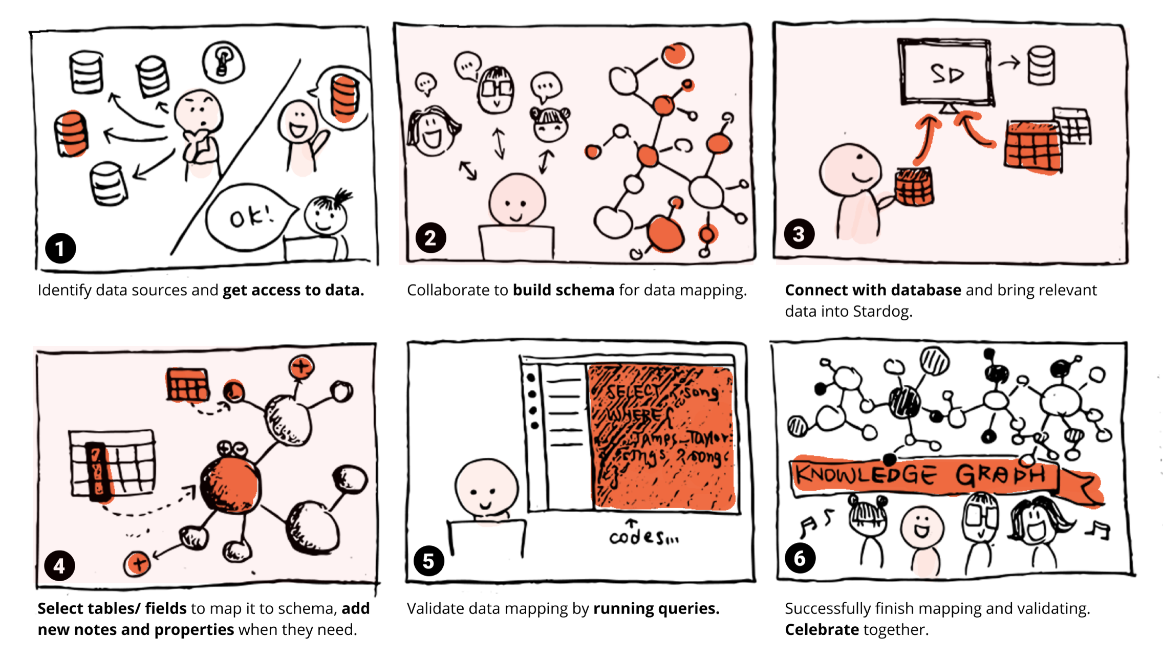
The process of building knowledge graph
Our project focus on frame 2 to 4, supporting users to do data modeling and mainly data mapping.
Main findings and design implications
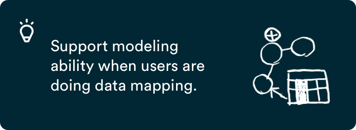
1. Modeling and mapping are very closely tied. When users work on mapping, usually they need to edit/ add new nodes or properties as needs arise.
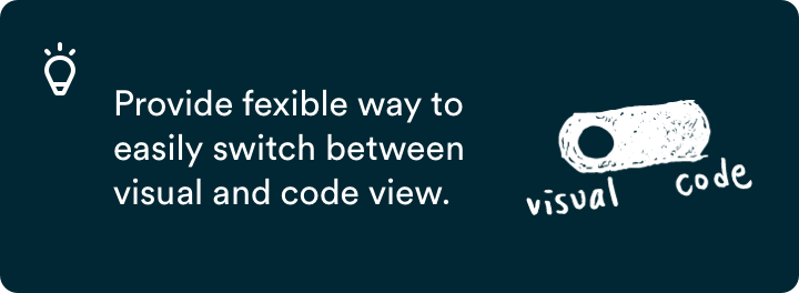
2. High-techies prefer coding. They are more comfortable with writing codes rather than using a graphical interface.
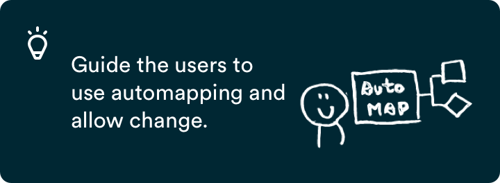
3. Auto-mapping is the default starting point for techies. The system auto-generates the data model and mapping for them which is editable.
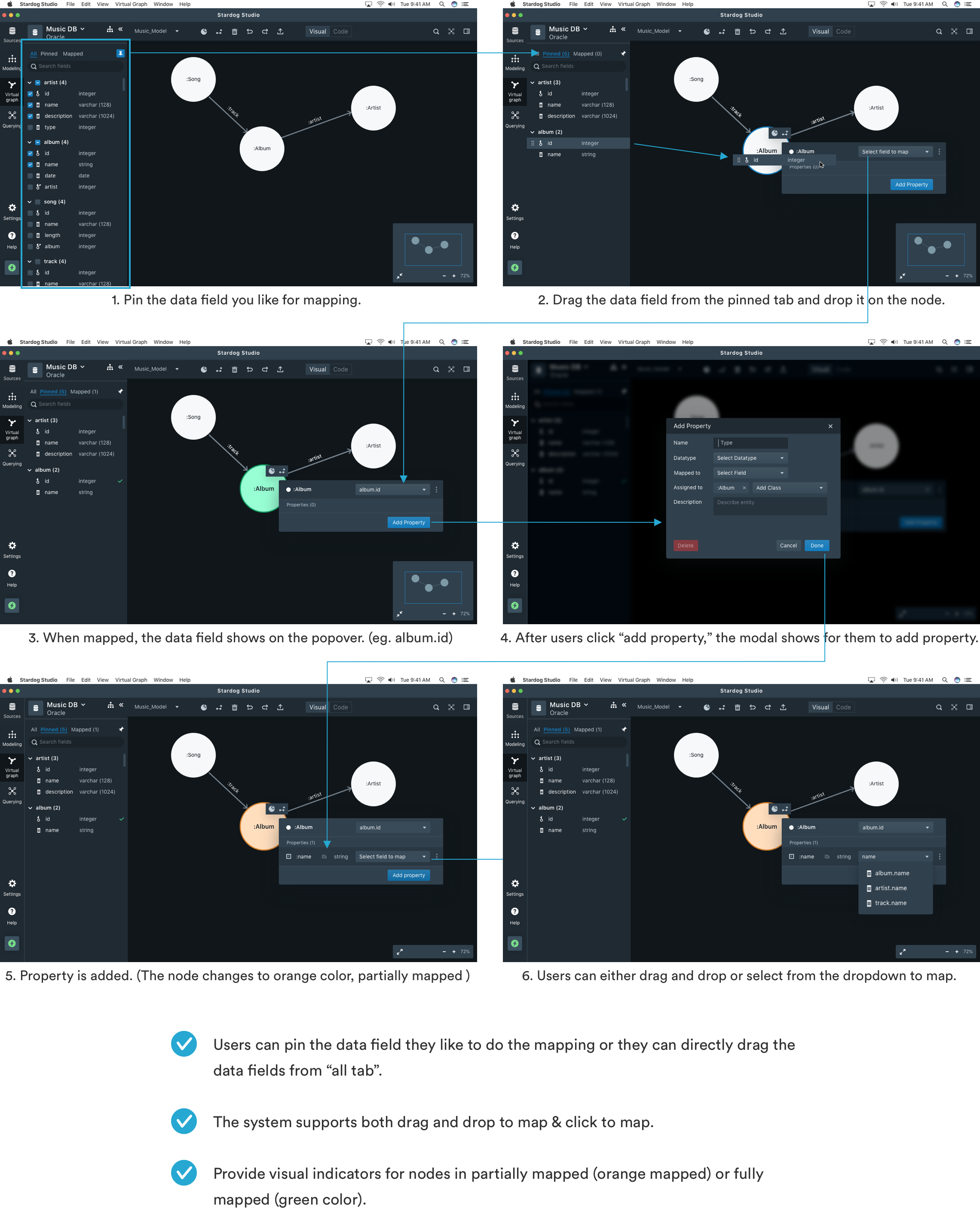
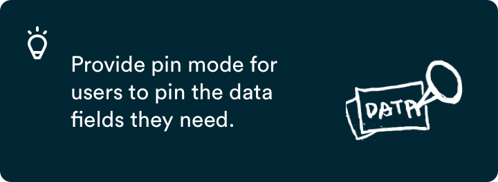
4. Users want to select some data before they start mapping. They select a few fields that they need to work on before mapping.
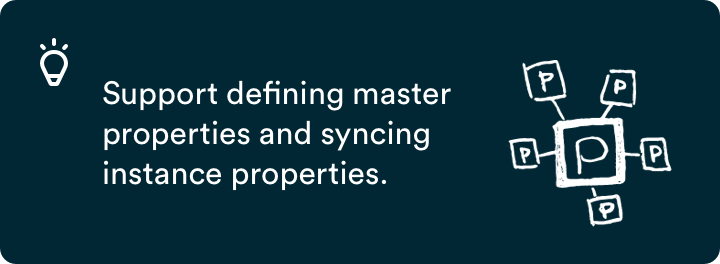
5. Defining properties separately. We discovered that users often define properties and classes separately, and later assign the properties to the classes and map them.
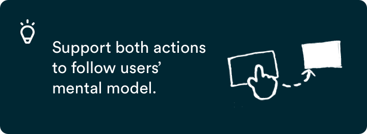
6. Click to map vs drag and drop to map. Users found both click to map and drag and drop mapping functionalities to be useful.
KEY DESIGN DECISIONS
Below are the 3 main design decisions and iteration we made during the whole design process based on testing.
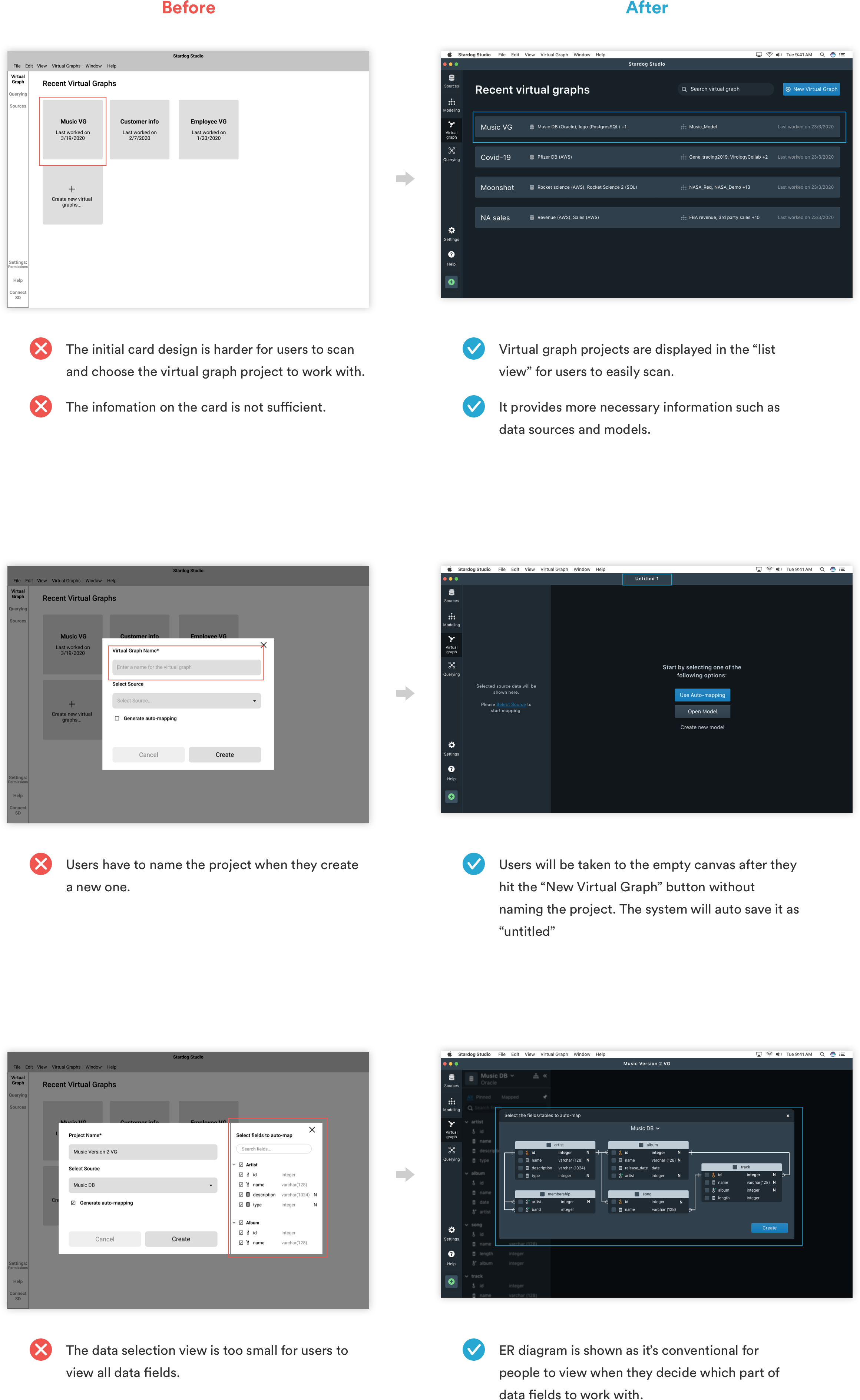
- The process of creating a virtual graph project.
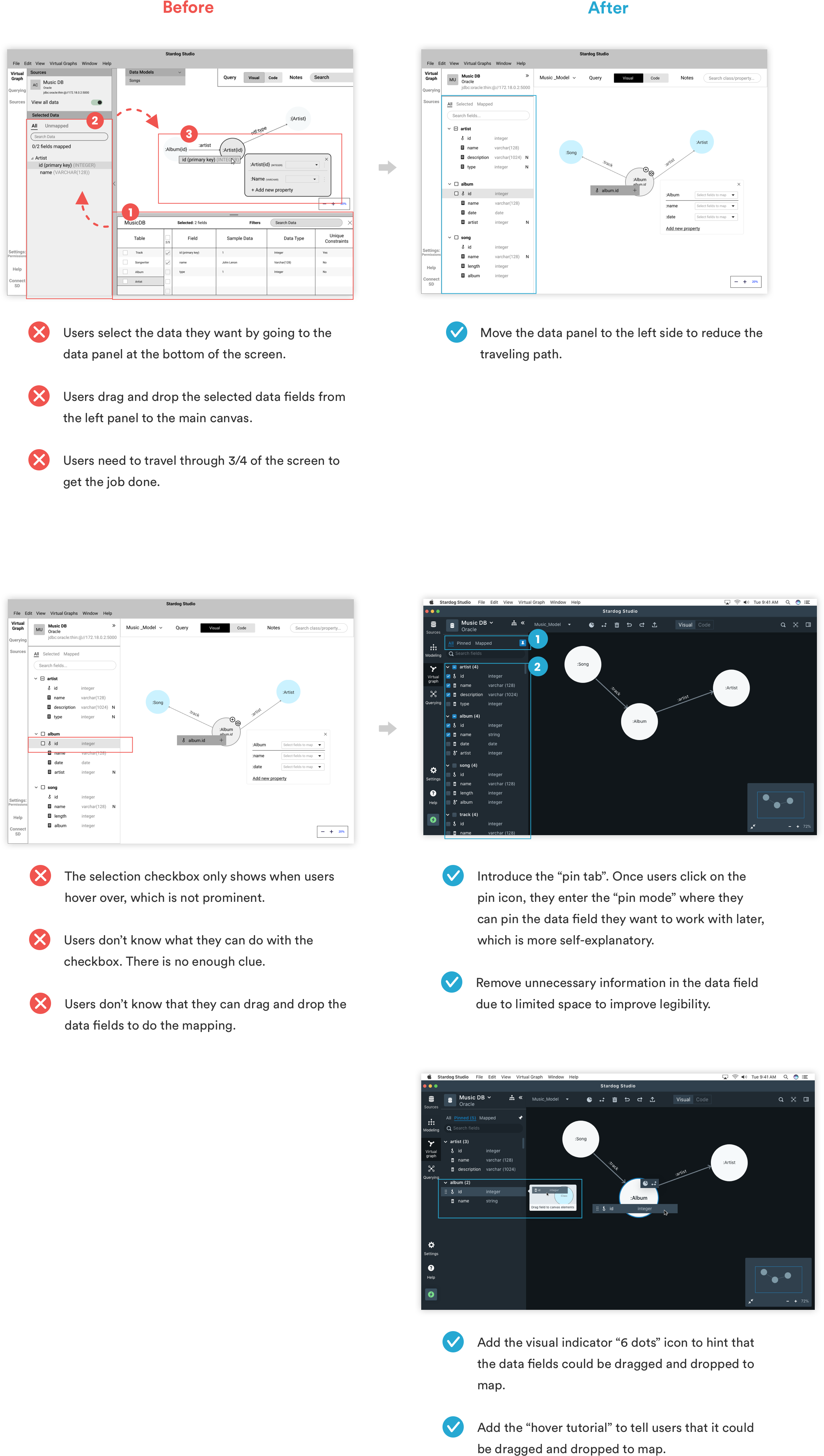
- The process of data selection and mapping.
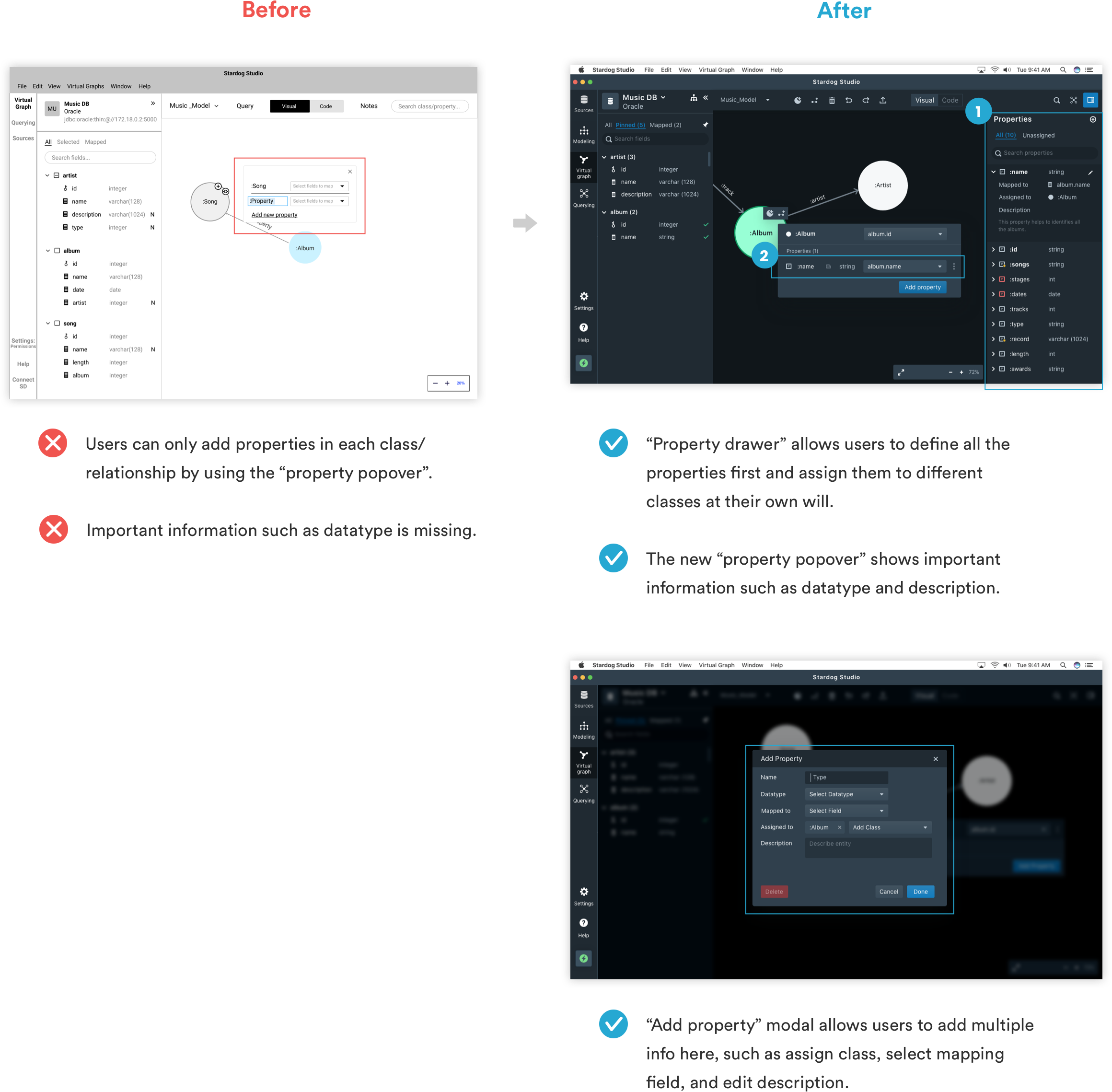
- The way of adding properties to support different use cases.
1. Don’t force users to name their project when they create a new one.
2. Reduce the efforts of the data selection and mapping process.
3. Created a flexible way to add properties and support different use cases.
STYLE GUIDE
Define typography, color, icon, spacing, components, and different states.
Use Blueprint.js as a starting point and create the icons, colors, components and states for different UI.
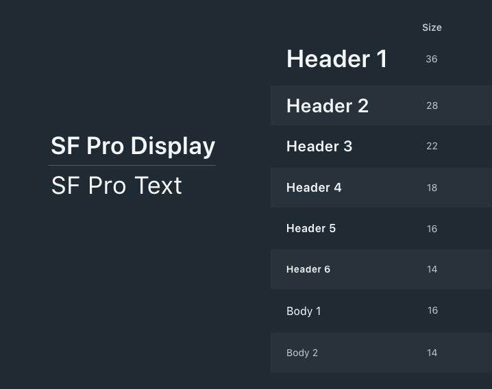
Typography
- Use 2 typefaces, SF Pro Display and SF Pro Text.
- Use different typefaces for header and body.
- Keep the body font size at 14 -16pt.
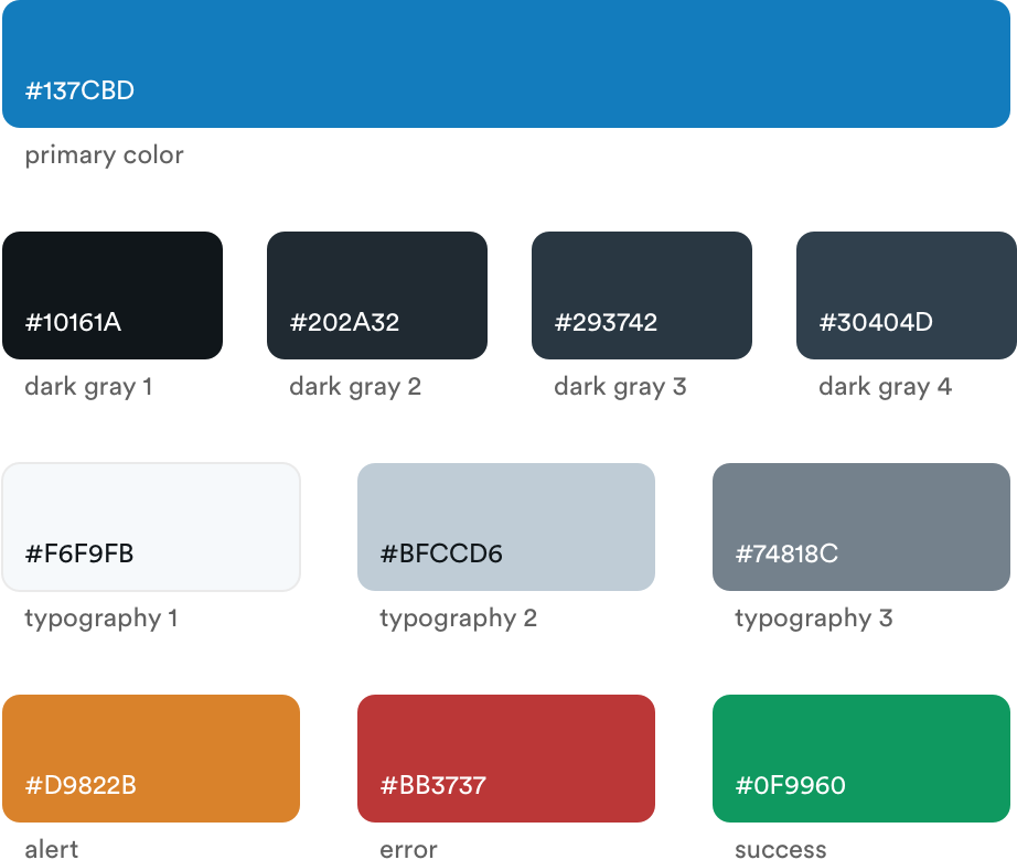
Color Palette
- Use grayscale colors as background color to allow the main contents to stand out. (dk gray 1: canvas background color, dk gray 2: drawer background color, dk gray 3: hover state, dk gray 4: popover background color.)
- Use primary color for call to actions.
- Identify light gray colors for typography.
- Use functional colors for important notifications, warnings, and errors.
Layout
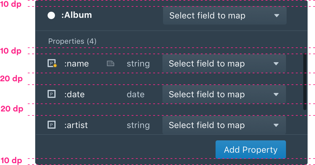
- Follow 10 dp grid system. Make sure the spacings are at least 10 dp.
- Smaller elements have at least 5 dp spacing.
Iconography
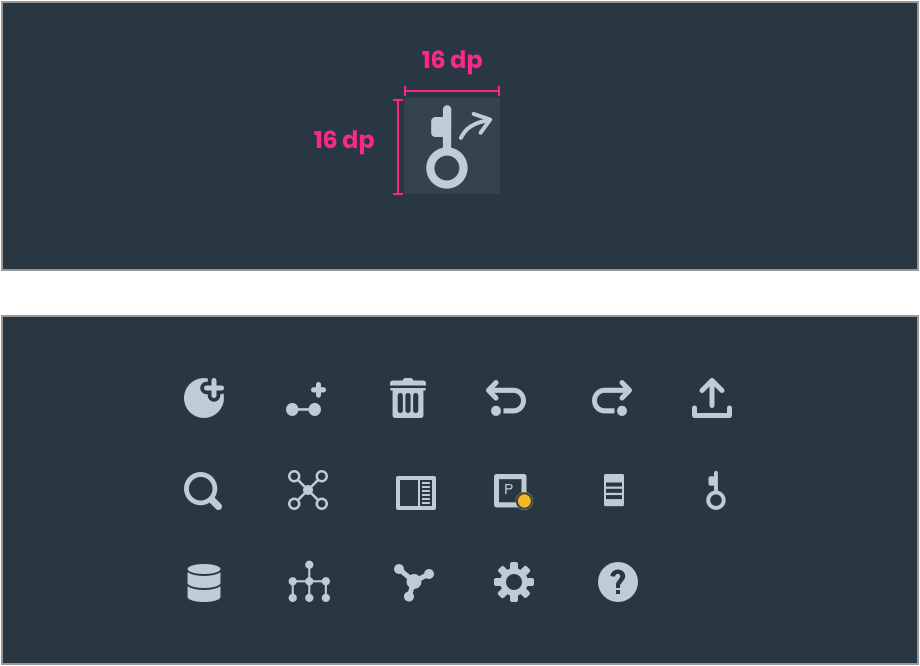
- Use icons in 16 dp. For larger elements, use icons in 20 dp.
- Ensure all icons have consistent styles and stroke weight.
TAKEAWAY
- Get comfortable with the unfamiliarity and uncertainty. Learn from the users and clients.
- Test the design as early as possible to make sure it aligns with users' needs and covers all use cases.
- Define colors, typography, iconography, and spacing. Create a single component with different states, craft reusable modules, and build the style guide.
- Collaborate and communicate with PM, clients, engineers, and the internal design team.

Other Projects
IBM Catalyst DesignUX research . UX design

Morgan Stanley Website RedesignUX research . UX design
STARDOGUX research . UX design

USA TODAYUX research . UX design

P & GUX design

PAIRUX research . UX design

VANITYUX research . UX design

LUCAS BENITEZVisual design . Motion design
